A technical overview of the Oracle Scorecard and Strategy Management features in OBIEE
Introduction
When Oracle Business Intelligence Enterprise Edition (OBIEE) 11g released to the general public back in August 2010, it included a host of new interactive front-end features: geo-spatial map views, hierarchical columns, selection steps, and more. In addition, BI Publisher showcased a brand new web-based development environment for models, templates and reports, which promised to increase the accessibility of BI Publisher to everyday BI deployments in OBIEE. Standing in the shadow of these major improvements to existing tools was the introduction of an entirely new module for OBIEE: Oracle Scorecard and Strategy Management (OSSM).
OSSM is built-upon the premise that a scorecard system should not be separate from the BI system, like many comparable tools are today. Instead of a separate application with its own data, its own data definitions, and its own front-end, Oracle made the choice to integrate OSSM directly into OBIEE in two key ways:
- OSSM directly leverages the OBIEE metadata repository layer.
- The content objects built in OSSM are another type of object stored in the OBIEE presentation catalog.
The first integration allows OSSM to source data from the same locations that regular reports and dashboards source from, and since OSSM points to OBIEE subject area columns the same way OBIEE reports do, the data definitions are the same. The second integration allows OSSM to leverage the same security as regular reports and dashboards, present scorecard content on those same dashboards, and allow for integration between the two. For example, dashboard prompts can also control scorecard content and scorecard content can navigate to an OBIEE analysis using actions.
OSSM and the BI Foundation Suite
A popular licensing option for Oracle's BI stack is the BI Foundation Suite, which is a per user or per processor license for the following software:
- Oracle Business Intelligence Enterprise Edition (OBIEE)
- Oracle Essbase
- Oracle Scorecard and Strategy Management (OSSM)
- Oracle BI Mobile
This licensing option provides a significant bundled discount over licensing these products individually, and with many customers wanting to use both OBIEE and Oracle Essbase, an increasing desire to roll-out BI on an iPad to various user groups, and Oracle Exalytics shipping with the BI Foundation Suite license, more and more customers are adopting the BI Foundation Suite. This means that, whether they realize it or not, they have full license to use OSSM.
Unless a company has plans to fully adopt a balanced scorecard methodology to drive performance in their organization, they likely aren't targeting the use of OSSM, though. The fact that the software capability is called out by its own product name has something to do with this (after all, if you don't have plans to build a scorecard, why would you use a scorecard product?), but the reality is that BI Foundation Suite eliminates the need for this perception problem. If you don't have the BI Foundation Suite and you need to license OSSM separately to take advantage of its capabilities, then it makes sense that you wouldn't plan to license it unless you planned to implement a scorecard methodology. But, if you already own OSSM through bundled licensing, and the product is seamlessly integrated into your OBIEE environment out of the box, then why not use it?
For Your Consideration: OSSM
OBIEE 11g contains a number of tools to develop user content in the system. The tool formerly known as Answers is the most popular interface to build content for OBIEE. With its out-of-the-box integration into OBIEE 11g and its new web-based authoring tools, BI Publisher is now an equal partner in the OBIEE development stack. In fact, there are common threads across these two tools:
| "Answers" Analysis | BI Publisher Report |
| Analytical Reports | Pixel-Perfect Reports |
| Very Graphical | Very Graphical |
| Interactive Views | Interactive Views |
| Can Appear on a Dashboard | Can Appear on a Dashboard |
| Prompt-able | Prompt-able |
As you can see, there is a lot of overlap between the high-level capabilities of each authoring tool. Here's what it looks like when you add OSSM to the mix:
| "Answers" Analysis | BI Publisher Report | OSSM Scorecard |
| Analytical Reports | Pixel-Perfect Reports | KPI Report |
| Very Graphical | Very Graphical | Very Graphical |
| Interactive Views | Interactive Views | Interactive Views |
| Can Appear on a Dashboard | Can Appear on a Dashboard | Can Appear on a Dashboard |
| Prompt-able | Prompt-able | Prompt-able |
Now you can see that all three authoring tools have some basic similarities and it becomes easier to understand why you would consider OSSM equally amongst Answers and BI Publisher when deciding which authoring tool best allows you to meet the requirements of what you're being asked to build. In fact, the rest of this article will attempt to show that OSSM can meet certain types of requirements better than the other two tools can.
OSSM: The Basics
Before proceeding, here is a quick explanation of how OSSM typically operates, whether you're building true balanced scorecards or attempting some of the ideas and examples this article is about to show. As mentioned at the beginning of this article, the Figure 1 below shows how the OBIEE RPD, or metadata layer, is a driving force behind OSSM, just like it is for Answers. KPI objects are built using columns exposed through a subject area from OBIEE's RPD file, where the KPI's "actual" value can point to one column and its "target" value can point to another. Multiple KPIs are then added to a Scorecard object, where they can be grouped into objectives and pinned to various dimensions they relate to. From there, a Scorecard object can contain any number of Scorecard Documents, or views, that present the KPIs on the Scorecard in some graphical fashion.
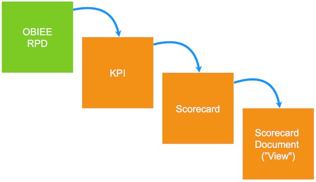
Figure 1: The basic building blocks of OSSM (orange blocks are OSSM objects)
This process is similar to what a developer would do in Answers. First they would choose a subject area, then select columns to define the data for the report, and then lastly build views for the compound layout of the report.
The Advantages of the KPI Object
The KPI object is the cornerstone of OSSM. When building the KPI object, there are three primary things you define:
- Where the KPI data comes from
- The dimensionality of the KPI
- The "states" the KPI can exist in
The first and the third bullets offer two of the biggest advantages of the KPI object in everyday BI:
- Built-in "actual vs. target" and "trending" calculations
- More advanced conditional formatting options
In the first stage of building the KPI object, you're asked to define the "actual value" and "target value" fields. While these are labeled using the words "actual" and "target," as shown in the figures below, there is no rule in OSSM that forces you to use real actuals and targets—you can use anything. Figures 2 through 5 below show how you can be creative and set anything as your actual and target.
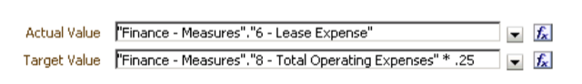
Figure 2: One column compared to a formula using another column
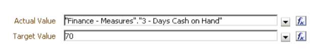
Figure 3: One column compared to a fixed-value

Figure 4: One column compared to another column
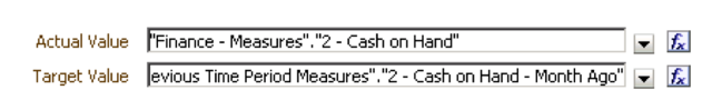
Figure 5: One column compared to the same value from a different period
Once the KPIs are defined, the benefit to the developer is realized once the KPI is added to a Scorecard document like a KPI Watchlist, as shown below in Figure 6:

Figure 6: KPI objects on a watchlist report
Note that the "Variance", "% Variance", "Change", and "% Change" columns are present on the watchlist. These are common calculations created for many BI reports and in OSSM they automatically appear. For a developer, that's four less secondary metrics to be created and maintained over time per primary metric.
In addition to helping you build additional metrics, OSSM creates trending with a simple checkbox. In Figure 6 above, you'll also notice a trend column, which shows how each KPI has moved since the prior period. When defining the KPI, you can decide whether to enable trending or not by checking the trend checkbox and selecting which prior period level to compare against (year, quarter, month, etc). A KPI with trending enabled will automatically display trending content on any Scorecard Document. This can manifest itself like the free-of-charge "Trend" column in Figure 6, or a handy trend chart available on other views, as shown in Figure 7 below.
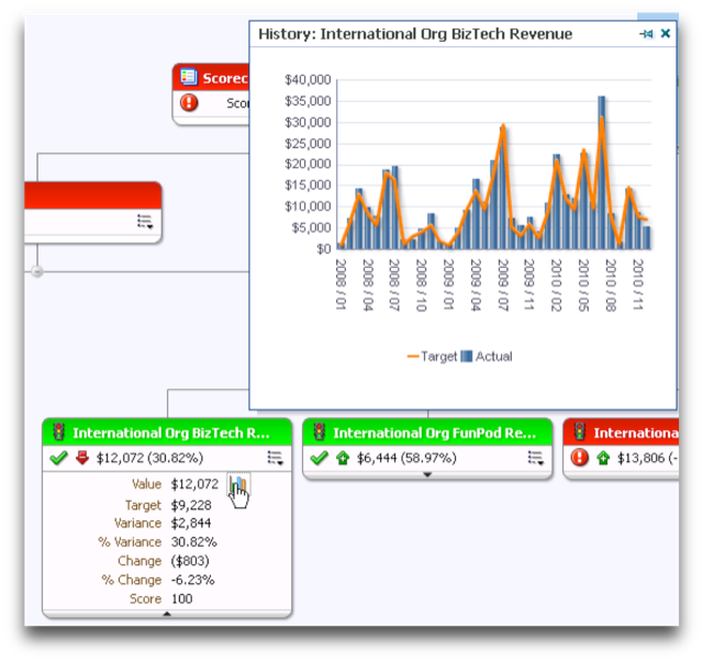
Figure 7: Built-in trend charts - no chart building required!
Another advantage of the KPI is its conditional formatting features. As noted above in Figure 6 and Figure 7, enabling the trending option for a KPI will create the typical up/down trending arrows for you. These trending arrows are pretty sophisticated and will also show a diagonal up/down arrow to imply a slight increase or decrease in the trend. If you were to apply this conditional formatting in Answers, you'd have to go into the column properties of each AGO variance metric on the report and build the criteria yourself.
The conditional formatting advantages go further than that, though. Look at Figure 8 below:
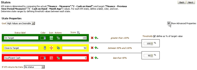
Figure 8: A more powerful conditional formatting window
The States screen in the KPI definition allows you to build a robust set of conditions for your KPI. Not only can you take care of color and icon display at the same time (OSSM uses the color and icons in different places, whereas Answers layers them on top of each other), but you can also give your condition a label and assign one or more actions to a state. The action feature is a key distinction from Answers because in the latter tool, you would have to build your condition formulas twice, since conditional formatting and actions are configured in different property panes.
Features OBIEE Could Benefit From
As was mentioned in the previous section, part of defining a KPI is configuring what dimensionality you want the KPI to use. This is determined by which dimensions join to the logical fact table that supplies the columns for the KPIs actual and target values. You can select all or just some of the available dimensions, depending on your requirements. The selected dimensionality will translate into a point-of-view (POV) bar, or a prompt, as shown in Figure 9 below.
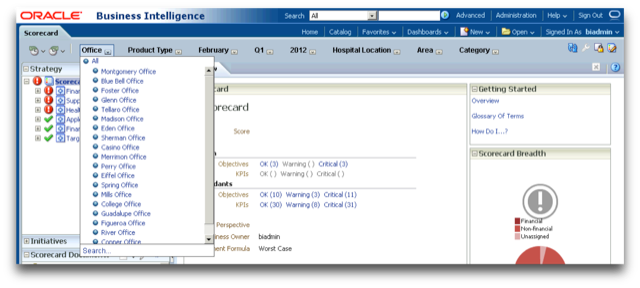
Figure 9: The POV bar is like a dynamic dashboard prompt
This automatic prompt is built from the dimensionality of all KPIs on the scorecard. As you add a KPI to the scorecard that leverages a dimension that hasn't been used by an existing KPI on the scorecard, a prompt for that dimension is automatically added to the POV bar, saving developers a lot of time.
There are other features of OSSM that go beyond pure timesaving benefits. They are:
- Comment threading
- Related documents
- KPI Agents
- Objectives
Once in a while, users will ask for the ability to comment on dashboard objects. While there are ways to address this request, none of those methods are as native as the comment system in OSSM. While this won't allow you to enter comments anywhere in OBIEE, or even on all OBIEE objects, it can be a way for a developer to address this requirement, as shown in Figure 10.
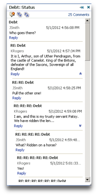
Figure 10: The OSSM comment system lets users discuss pressing matters
The Related Documents feature allows you to guide users to pertinent reports, help documents, or anything else you can think of, as shown in Figure 11.
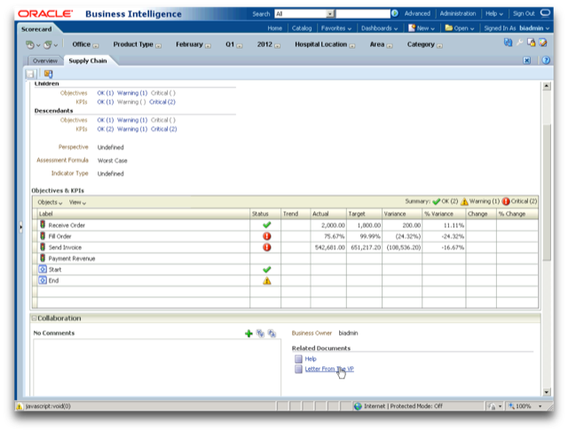
Figure 11: Guide users to relevant content with Related Documents
Right-clicking on any KPI in a scorecard will allow the user to create a KPI Agent, which offers a much simpler screen for an end user to create an Agent based on a condition (see Figure 12). The user can also pin the KPI Agent to a specific dimension value, which is an added bonus over a regular Agent. While the user will still be taken to the more complicated Agent screen to schedule the KPI Agent, most of the content is already pre-populated for them.
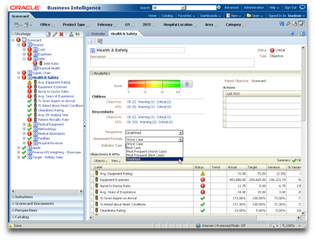
Figure 12: A much simpler way to create an Agent
The last feature that OBIEE could benefit from is the Objective. In traditional OSSM, the Objective allows you to define a goal for your organization and link KPIs to the Objective to understand if you are meeting your goal. One way in which OSSM does this is to assign a score to the Objective based on the states each KPI within the Objective. OSSM has many ways to create this score and an OBIEE developer can tap into this capability.
Figure 13: Options for aggregating KPIs into an Objective score
In the metadata layer of OBIEE, there isn't a straightforward way to aggregate values of different types. How do you aggregate a dollar amount, a count, and a percent? Well, with an Objective you can, because OSSM can assign the Objective a score based on the state its KPIs. OSSM also offers multiple ways to calculate this score, including a weighting option (Figure 13 above), which allows the developer to allocate each KPI differently, creating more complex scores.
Views "Answers" Doesn't Have
As mentioned at the top of this article, creating scorecard documents is the last step in developing for OSSM. These documents can be viewed inside the OSSM module or placed on a dashboard. While they're called 'documents,' it's more appropriate to think of them as views in the traditional Answers sense. There are 5 primary types:
- Strategy Tree/Wheel
- Strategy Map
- Cause and Effect Map
- KPI Watchlist/Smart Watchlist
- Custom View
Each of these document types offers everyday BI additional value, whether it's improving upon table or pivot table views in Answers, or offering something completely new. Let's take a look at each type and see how.
The Strategy Tree offers the ability to view Objectives and their related KPIs in a hierarchical view, almost like an organization chart. If you apply some creativity to defining the Objectives and KPIs (think one metric repeated many times with a different dimensional FILTER each time), you could create a custom hierarchy that spans multiple dimensions, like Figure 14 below. In this case, nested Objectives create custom groupings in one dimension, but ultimately drill down into KPIs filtered across two dimensions. This approach even allows you to see where data doesn't exist at any given point in time, as shown by the grey box in Figure 14, without having to create an outer join
.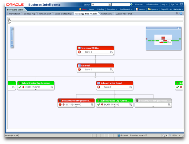
Figure 14: A custom hierarchy across Organization and Product
The Strategy Map is normally designed to show relationships between KPIs across an OSSM feature called perspectives. To look at perspectives another way, we can use this view to monitor a business process. Consider the simple business process in Figure 15.
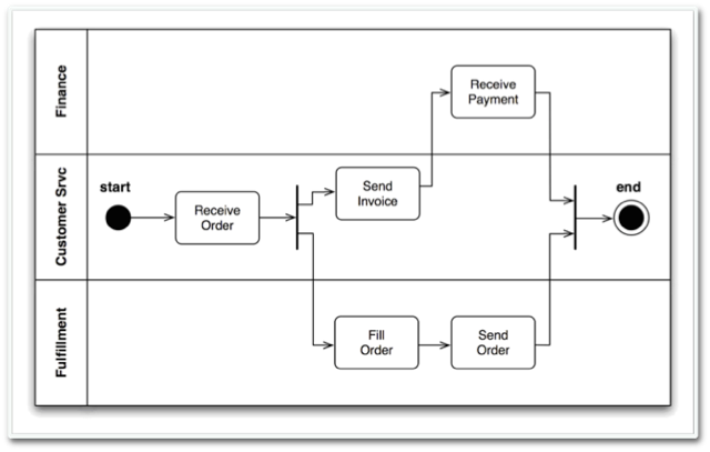
Figure 15: A simple business process
The swim lanes used to designate the departments responsible for processing an order map to the perspective functionality employed by the Strategy Map. While the arrows in a Strategy Map are meant to imply a relationship, there's no reason they can't imply a flow. Creating an Objective for the start and end of our process, and creating KPIs for the key steps between, a developer can create a nice view that gives the user visibility to where a business process might be breaking down, as shown in Figure 16.
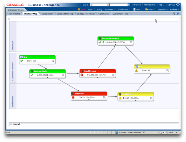
Figure 16: Visualizing the breakdowns in the process
The Cause and Effect Map is designed to highlight reasons why a single KPI might be performing poorly. This is actually one of the driving forces behind drilling and navigating in everyday BI—why did something happen? In this case, we'll look at a simple report in Figure 17.
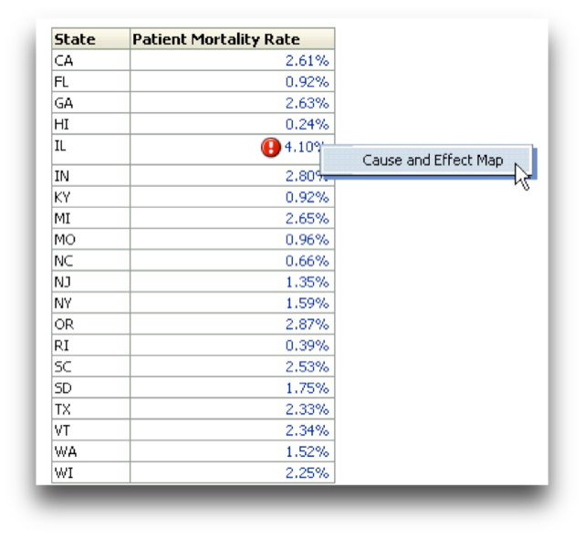
Figure 17: A basic OBIEE report with a problem
In this simple report, the state of IL has a higher patient mortality rate than desired. Why is that? Before OSSM, we may develop a drill or navigation to another tabular report to allow the user to get more information, but instead we're going to take them to a Cause and Effect Map, which guides them to the four possible areas that can affect patient mortality rate (people, equipment, facilities, and methodology) and look at metrics that drive those factors. Using the Cause and Effect Map in Figure 18, the user can quickly see where the breakdowns are.
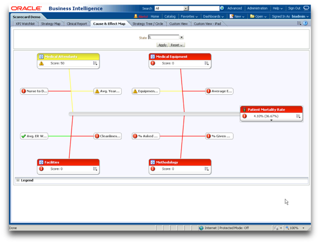
Figure 18: The causes of high patient mortality rates
Moving to the two watchlists, there are two features to highlight that can be beneficial in everyday BI. For the KPI Watchlist, the value is simple: nowhere else in OBIEE can you build a tabular view which splits a core metric from its variations (actual, target, variance, change, etc.). Unless you actually model a metric dimension in your data, pivot tables can't present metric info in both the rows and the columns at the same time, as shown in Figure 19. This layout allows you to compress a lot of information into a small space.
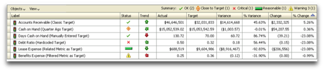
Figure 19: No other view can present metrics as both rows and columns simultaneously
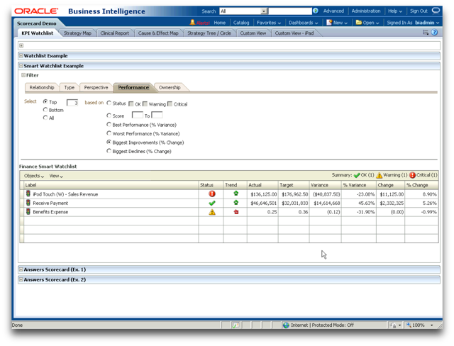
The Smart Watchlist goes a step further. While still keeping the basic structure of the KPI Watchlist shown in Figure 19, the Smart Watchlist adds a control interface above the table to enable sophisticated filtering. Want to know what the top 3 KPIs are based on the biggest improvement from the previous period? A few simple clicks will show the user that, as shown in Figure 20, with no extra coding time required by the developer to build sophisticated prompts.
The final view is the most flexible and inspiring because it can literally be anything. When all else fails and you can't bend and twist an existing view to do what you want, take a look at the Custom View in OSSM. By overlaying KPIs on top of any image, the possibilities are endless. You can almost think of this as the "Map View" for a dimension other than geography. In the example in Figure 21, KPIs for product sales are layered over an image of the retail circular for that period, allowing the user to see the sales performance from the eyes of the customer.
Conclusion
OSSM has a bright future in the OBIEE stack. While every OBIEE customer should be thinking about how they can use it to drive performance in their organization, some companies aren't ready for the discipline required to make it happen. Rather than put OSSM on the shelf to collect dust, BI developers should leverage its powerful objects, features, and views to enhance everyday dashboards, save precious development time, and deliver challenging requirements.